Working with the Adobe Color App – Preparation for Creating a Logo and Infographics
To locate this application, you need to use your Creative Cloud Desktop console. Choose the Apps tab. Refer to Figure 2-10.
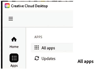
Figure 2-10. Creative Cloud Desktop with All Apps tab selected
Then on the left, select All Apps, and from the middle section, choose the Web icon tab. Refer to Figure 2-11.

Figure 2-11. Creative Cloud Desktop with All Apps tab selected and Web icon tab selected
Scroll down the list of applications and locate Adobe Color and click the Launch button. Refer to Figure 2-12.
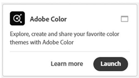
Figure 2-12. Link to Adobe Color online app
This will bring up the Adobe Color Application in your browser and you can begin to start working with the Color Wheel and apply Color Harmony Rules. Refer to Figure 2-13.
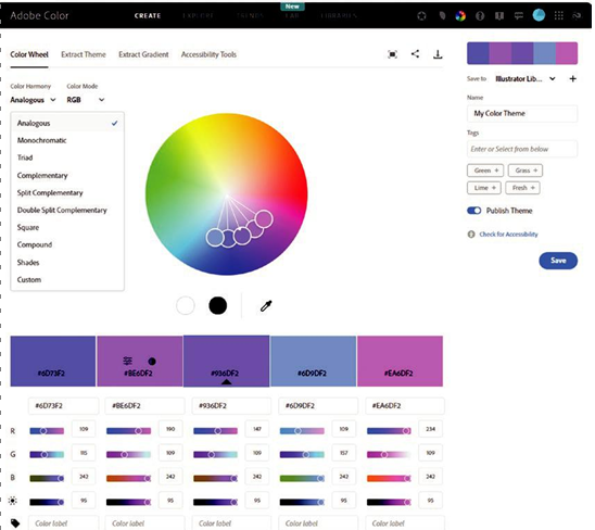
Figure 2-13. Adobe Color online app layout in the browser
Note Due to the application being online, the layout is subject to changes and new features being added frequently.
In this example, we are in the Create section on the Color Wheel tab.
Other sections like Explore, Trends, Lab, and Libraries will allow you to look at images in relationship to color or past color themes in Libraries that you have created.
Refer to Figure 2-14.

Figure 2-14. Create section is currently selected for Adobe Color
Lab, which is a new feature, will allow you to recolor vector artwork from an SVG file. While not relevant to this book, you may want to explore this option when you work with SVG files in Volume 3. For now, remain in the Create section.
Also, in the upper right of the dark bar are additional settings to link with other features, adjust how you preview the colors on a white or dark interface theme, color game, help, forum, feedback, login settings, web and apps services, and other Creative Cloud settings. You can ignore these for this book. Refer to Figure 2-15.

Figure 2-15. Adobe Color additional resource links
For now, remain in the Create section on the Color Wheel tab. Refer to Figure 2-16.

Figure 2-16. Create section in Adobe Color with Color Wheel tab selected
This area has a section called color harmony where you can choose various rules from the drop-down menu. Adobe says you can use the color rules to ensure a harmonic balance of colors based on the color you have set as the base color. Currently in this example, analogous has been selected, and the base color is the middle one in the bar of five with a black or white upward-pointing arrow depending on the color it overlays. Refer to Figure 2-17.
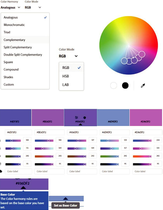
Figure 2-17. Adobe Color Wheel selection with current layout setup and default harmony rule
I’ll mention more about base color and other settings including color mode in a moment as seen in Figure 2-17. However, let’s take a moment to review how each of these harmonies is based on the color wheel. Refer to Figure 2-18.
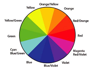
Figure 2-18. Review of the color wheel and its segment names
To understand color, it’s important to know that the 12 colors or hues in our wheel fall into two main categories, warm or cool. This is collectively known as temperature.
Warm colors fall in the red to yellow range, and we associate these hues with activeness, warm seasons (summer), or aggressiveness. Refer to Figure 2-19.
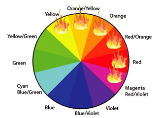
Figure 2-19. Colors that fall into the warm zone on the color wheel
Cool colors fall in the green to violet range, and we associate these hues with passiveness, the cool season (winter), or something that recedes. Refer to Figure 2-20.
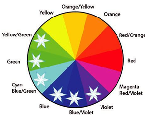
Figure 2-20. Colors that fall into the cool zone on the color wheel
However, when we design with color theory and harmonies, we don’t just stay within these rules. There are other rules and combinations that mix warm and cool colors in a harmonious or discordant blend.