The Science of Color – Preparation for Creating a Logo and Infographics-3
RGB can capture more colors than the CMYK model, but the area doesn’t equally overlap in all cases, and that is why your monitor (additive) cannot accurately tell you how a printed (subtractive) item will look. These ranges can vary from media to media depending on what is trying to reproduce the color range.
Over time, some designers have tried to find ways to compensate. For example, to capture yellow better on a TV screen, they have attempted to add a yellow light to the RGB known as Quattron (QuadPixel technology) to get a higher range of colors in the yellow. However, this technology only apparently lets through more red and green light resulting in less than accurate color. In CMYK printing, booster or spot colors like reds or orange and greens are added as additional inks to the inkjet printer and offset presses to achieve a higher range of the visible spectrum. However, in the case of the press, unless you know how these colors will interact with one another, you can get some undesirable results. Due to this and economic reasons, it is why most offset press projects stay within the four colors of CMYK.
To work with color theory on our computer, we need to look at a blend of the two color wheels. To do that, we will be looking at the traditional color wheel that blends both the ideas of RGB and CMYK and what is seen by the human eye into one wheel. Shortly we will look at Adobe Color, and then later you can use the Photoshop and Illustrator applications to deal with the exact interpretation of the pigments if you plan to print or use them online. Refer to Figure 2-7.
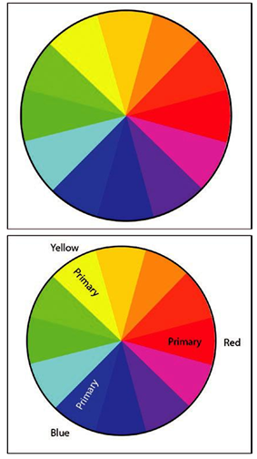
Figure 2-7. Color wheel and primary colors on the wheel
If we remember from school, we were taught red, yellow, and blue are primary. Here on the wheel, they are spaced evenly.
You can mix red and yellow to make orange, yellow and blue to make green, and blue and red to make a purple violet. These are known as the secondary colors of the wheel. Refer to Figure 2-8.
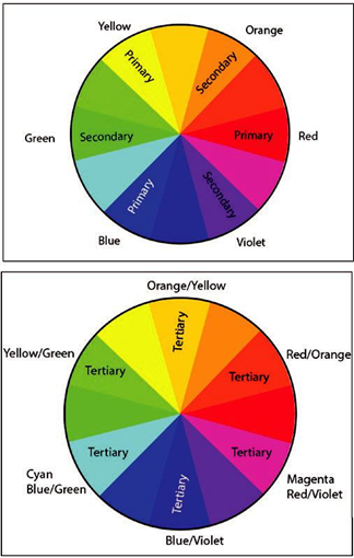
Figure 2-8. Color wheel with primary, secondary, and tertiary colors
You can then mix the colors between a primary and a secondary to create a third set of colors known as tertiary. Refer to Figure 2-8.
So that these colors on the wheel blend with traditional and modern views, I have classified the names as such: orange/yellow, red/orange, red/violet (also known as magenta), blue/violet, blue/green (also known as cyan), and yellow/green. Refer to Figure 2-9.
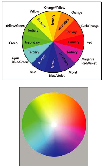
Figure 2-9. All colors listed on the wheel and as they appear as a gradation
However, it is important to remember that color does not fall into neat zones and this is a rough approximation of how color falls. In reality, outside of the computer, color is more graduated. Who really knows precisely where one color begins or another ends?
Some clients may already have picked out some colors for you which you can use in your project. However, if it’s up to you to choose the colors, where should you begin? How can you easily learn some rules about color theory and harmonies? Adobe has an online app called Adobe Color that you can use to adapt five colors to several harmony rules.