Color Science 2D and 3D visualization – Preparation for Creating a Logo and Infographics-1
From what you have seen so far about the color wheel, it may seem like color is pretty two dimensional, but this is not so. Just like in nature which has three dimensions, so is the range of color. Some colors, while we can see them in the visual world, just can’t be reproduced on the screen or in print. They go out of gamut or out of range. To imagine three-dimensional color, we need to know what the three dimensions are. Earlier in the chapter, we looked briefly at a compression chart CIE chromaticity diagram for comparison. Refer back to Figure 2-6.
This figure showed a spread-out color wheel in a more triangular image because the color is in actuality, not evenly displaced. From this diagram, we can see that the full-color range would represent visual light. Next might be photographic film that light passes or filters through. Next would be the RGB or the computer screen and finally the CMYK printing press. Colors that are not within the respective boundaries are considered out of gamut by that device, and additional colors would have to be added to increase the range. This can vary from one printing device to another. Like an inkjet printer that may have a greater range than an offset press, this printer as well as your monitor must be calibrated to achieve optimum results.
However, the three dimensions of color can be better understood in the shape of a sphere or cylinder.
The first is hue or pure color, and we looked at this in the last segment as we went around the color wheel choosing color harmonies in Adobe Color.
Here I have turned the hue on its side so that it can be better visualized with the next two dimensions. Refer to Figure 2-38.
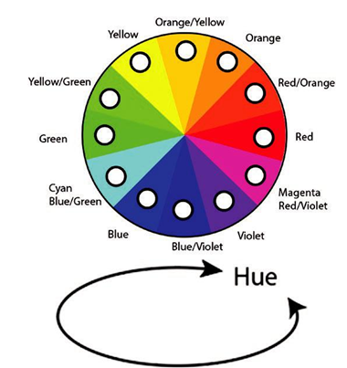
Figure 2-38. Color wheel and diagram explaining hue
The next dimension is known as saturation. This controls how intensely vivid, muted, or pure the colors will be in relation to graying. Another name for this is chroma, or some artists refer to it as tone. Saturation moves out from the center point in percentages or steps to its purest point on the very outside of the color wheel. Refer to Figure 2-39.
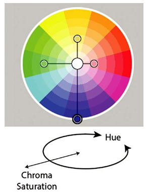
Figure 2-39. Color wheel and diagram explaining chroma/saturation
This is very useful to know when dealing with complementary color harmonies, as we saw earlier, so that the color options are not too intense. We can add a few saturations of gray of the same color in between to make the combination more visually manageable.
The final dimension that we need to be aware of is brightness or lightness. It is also known as value or the purest forms of black and white on the grayscale also known as shades and tints when added with a specific hue. Brightness affects luminance and the amount of light reflected. Here we are moving up and down. Refer to Figure 2-40.
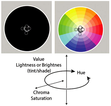
Figure 2-40. Color wheel and diagram explaining brightness/lightness
Neither Adobe Color nor Illustrator’s Color Guide shows a three-dimensional model, rather they use a slider, which we will look at in the next segment, to control the brightness level.
This three-dimensional model uses what is called hue/saturation/brightness, also known as HSB in the computer. Here is how it looks in three dimensions and in RGB color mode as well. Refer to Figure 2-41.
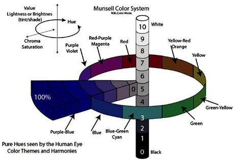
Figure 2-41. Munsell color diagram imagining color to be displayed as a perfect cylinder