Color Harmony Definitions – Preparation for Creating a Logo and Infographics-2
•\ Split Complementary: To deal with this intenseness, you can create a split complementary that uses three hues, where one hue in the original complement is split to hues over to the left or the right, and these arm swatches can be moved closer or farther from the base color inward or outward. Refer to Figure 2-25.\
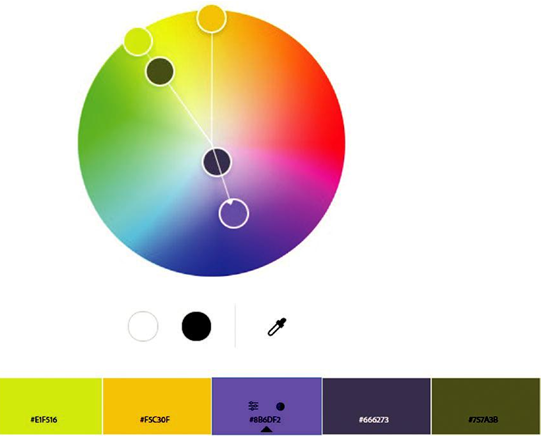
Figure 2-25. Adobe Color Split Complementary options on the wheel and resulting swatches based on base color selection
You can then choose to use only the hues on the left or the right or on both sides of the complement. One thing to remember, when dealing with complementary, is you need a good contrast of dark and light for legibility when adding text onto contrasting backgrounds. Otherwise, the text will be difficult to read and cause eyestrain, especially with larger amounts of text. We’ll talk about this later in the chapter. Refer to Figure 2-26.

Figure 2-26. Good contrast on the left but may not work well with smaller fonts due to complementary colors and may need further adjustments; on the right, contrast is bad, and colors cause eye strain at any font size
•\ Double Split Complementary: Splits the complement in two, moving over a step to the left or right. Currently, you can recreate this using this option from the list. Refer to Figure 2-27.\
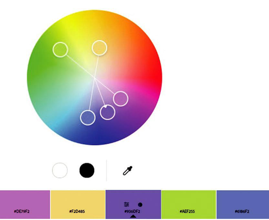
Figure 2-27. Adobe Color Double Split Complementary options on the wheel and resulting swatches based on base color selection
However, if you want the split to be more analogous, create a double analogous complementary instead by using the custom settings, which you can alter by choosing the custom option in the color harmony list and move the swatches independently. Refer to Figure 2-28.
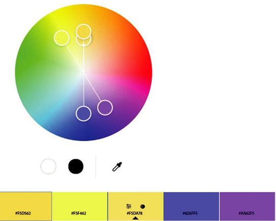
Figure 2-28. Adobe Color Custom Double Analogous Complementary options on the wheel and resulting swatches based on base color selection
Another custom variation on this is known as the alternate complement. This uses a triad with alternate colors in the middle. Use the triad option to set this one up and then move to the custom option and adjust at least one of your swatches. Refer to Figure 2-29.
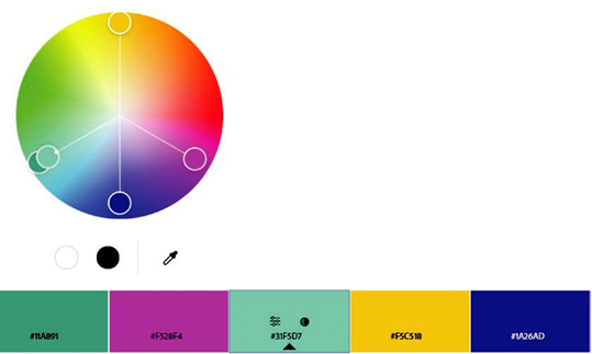
Figure 2-29. Adobe Color Custom Alternate Complement options on the wheel and resulting swatches based on base color selection