Color Harmony Definitions – Preparation for Creating a Logo and Infographics-1
•\ Analogous (analog): A color combination where two, three, four, or even five hues can be touching or adjacent.
First, a base or active color is chosen, and then the other colors move based on the placement of that color. You can then move to other colors together on the wheel as you cycle around; this is true for all color themes and harmonies. A variation on analogous is known as split analogous, which you could create if you drag on one of the outer colors on the wheel using the custom option. This makes the hues one step apart. A good tip to remember about analogous is this combination is good for blending or gradation of one color into another. Refer to Figure 2-21.
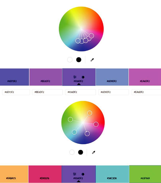
Figure 2-21. Adobe Color Analogous and Split Analogous options on the wheel and resulting swatches based on base color selection
•\ Monochromatic: Is when color stays in one hue like red or green or in this example purple. The color does not go beyond those boundaries and stays within a very strict zone. At least five swatches can be dragged out. If you are working with just black and white, this would be known as achromatic which uses the grayscale. Though the grayscale technically lacks color, it can create some very striking effects in art. In Adobe Color, it is also related to another harmony theme called shades, which we will look at later. Refer to Figure 2-22.\
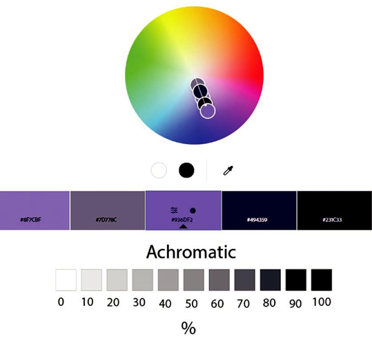
Figure 2-22. Adobe Color Monochromatic options on the wheel and resulting swatches based on base color selection and achromatic diagram
•\ Triad (Triadic): Uses three evenly spaced hues set at about 120 degrees on the circle. It has some similarities to the split complementary, which you will look at later, but in this case, the arms of the hues are farther apart on the left and right and create a greater variety. Notice how red, yellow, and cyan/blue could form a triad, but at least one or two muted colors are a part of the harmony as well. Refer to Figure 2-23.\
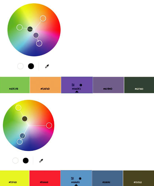
Figure 2-23. Adobe Color Triad options on the wheel and resulting swatches based on base color selection
•\ Complementary: For the most part, it uses two hues at opposite ends of the color wheel. For direct complementary colors, when using the purest hues, they can sometimes clash, or what feels like a vibration with the eyes and causes an afterimage when stared at too long. The eye is fighting for what color should be seen; it wants to blend colors, and this causes discordancy. To deal with this, try using at least three transitionary graying of hues and add them to the mix so that the colors blend and transition with the eye. However, in some cases, this may still not be enough to achieve harmony. Refer to Figure 2-24.\
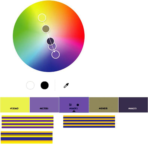
Figure 2-24. Adobe Color Complementary options on the wheel and resulting swatches based on base color selection and examples of vibrating color and making transition muted colors