Accessibility Tools for Contrast and Color Blindness When Dealing with Text and Graphics – Preparation for Creating a Logo and Infographics-1
One final thing to keep in mind when working with the color wheel is contrast. Are you using colors that have enough contrast? Are the colors distinct enough that they don’t blend into one another and disappear?
You will know the difference because high contrast colors give a good range, while low contrast colors start to become difficult to tell the difference between. Here I am using six different colors in this fish, but if all the colors become too dark, each color becomes difficult to see. Refer to Figure 2-47.
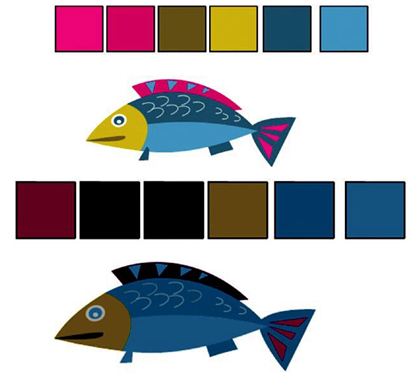
Figure 2-47. Fish images with high and low contrast swatches
A good range of high contrast text is more legible. However, with low contrast, colors become moody, somber, and muted as with the fish. With text, it becomes difficult to read. Refer to Figure 2-48.

Figure 2-48. Text with high and low contrast; the text on the right is hard to see
You can use this knowledge to create variations on the analogous, complementary, triad, or tetradic themes later with Photoshop and Illustrator. And as you learn more about the rules, you will see where you can alter these themes and make your own variation choices.
Remember, hue interacts with saturation and brightness to create colors that can be of high and low contrast. Also keep in mind how we saw complementary colors earlier affecting readability and contrast.
We can see this more clearly when we work with the Adobe Color Accessibility Tools tab. Samples of text can be reviewed against the contrast or color blind safe checker. In the first example, look at the Contrast Checker tool. Refer to Figure 2-49.
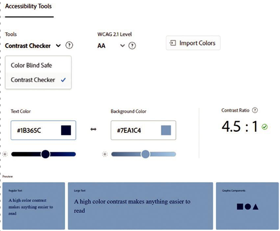
Figure 2-49. Adobe Color Accessibility Tools tab and some of its options to determine pass or fail
Once that option is selected, you can set the WCAG 2.1 Level. This refers to the Web Content Accessibility Guidelines, and it can either be Level AA or AAA. This area has an info button for more details that explain the criteria for how large regular text, which is 18pt and above, or 14pt and above for bold font weight, as a different ratio to qualify to when set to the AA or AAA settings. This also applies to regular text that is 17pt and below or 13pt and below for bold font weight. One color setting may pass for large text and graphic components (icons and actionable graphics) but fail for smaller text. Refer to Figure 2-50.
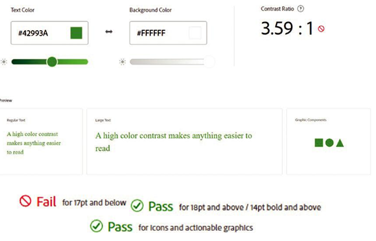
Figure 2-50. Adobe Color Accessibility Tools tab and some of its options to determine pass or fail—some text will not pass at a small size
More details can be found on the following page:
https://helpx.adobe.com/creative-cloud/adobe-color-accessibility-tools.html