1801 AD–1900 AD – What Are Infographics?
Playfair also began creating the circle pie chart to show the part/whole relationship in 1801, but this particular chart did not become popular until Florence Nightingale (1820–1910), the founder of modern nursing, began using it more frequently in 1857 in the form of a polar area diagram, or similar to a radial histogram. Nightingale’s “Rose diagram” was used to explain patient mortality in the military field hospital she managed during a specific year. A copy of that chart was sent to Queen Victoria the following year. Refer to Figure 1-11 and Figure 1-12.
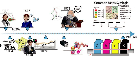
Figure 1-11. Pictorial timeline of 1801–1900 AD
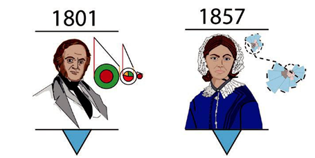
Figure 1-12. Pictorial sketch of Playfair with his pie chart and Nightingale with her “Rose diagram”
In 1858, Charles Joseph Minard (1781–1870), a French engineer, used the more traditional pie chart in his map about cattle for consumption in Paris. He also, in 1869, created an infographic on the discussion of Napoleon’s disastrous march on Moscow. Refer to Figure 1-13.
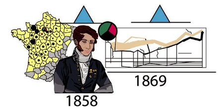
Figure 1-13. Pictorial sketch of Minard with his map, pie charts, and infographic about Napoleon’s march in Moscow
You will look at how to create similar kinds of graphs using Illustrator in Volume 2 of this work.
However, the term graph, which was applied to diagrams, is attributed to James Joseph Sylvester, a mathematician in 1878, when he first used this term in the science magazine of Nature where he published some of the first mathematical graphs. Refer to Figure 1-14.
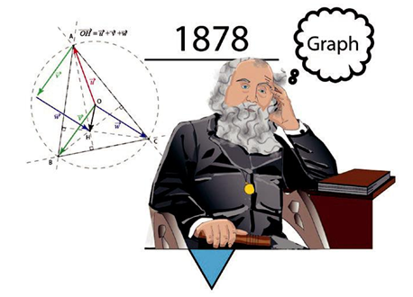
Figure 1-14. Pictorial sketch of Sylvester and his coining of the word graph, the Sylvester’s triangle problem on the left was later named after him
The 1820s and onward also continued to see the development of the map and modern geography with, besides legends and scale, the addition of symbols and icons. Refer to Figure 1-15.
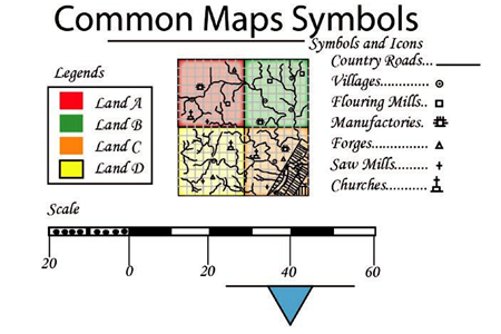
Figure 1-15. Pictorial examples of some map symbols, scales, and legends that began to appear on maps after the 1820s
We can see, at this point, the visualization of information or data was becoming very important to the general public, as these types of infographics were being more and more frequently published. Also, at this point, printing techniques were moving away from woodcuts and etched stone and were improved with hot metal type and later offset lithography on metal and rubber plates to facilitate easier and faster distribution of this data in books and magazines. Refer to Figure 1-16.
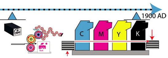
Figure 1-16. Pictorial examples of print improvements in metal type and offset printing in the 1800s–1900s